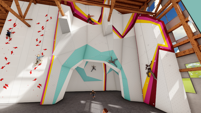
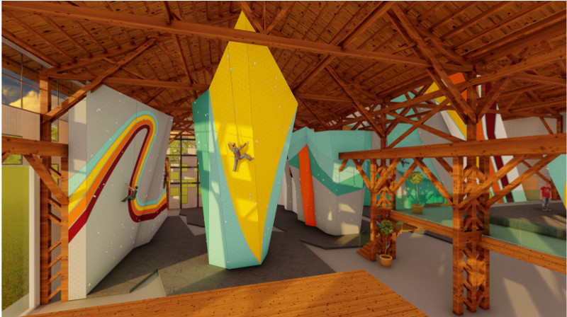
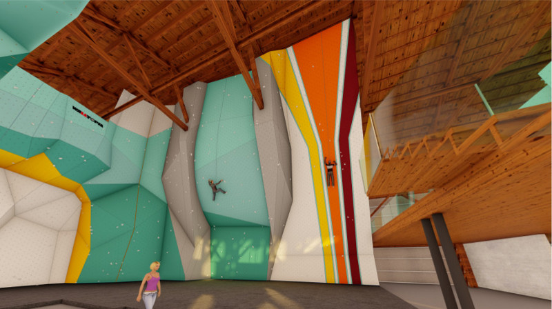
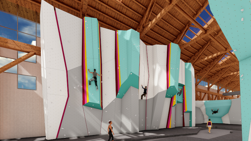
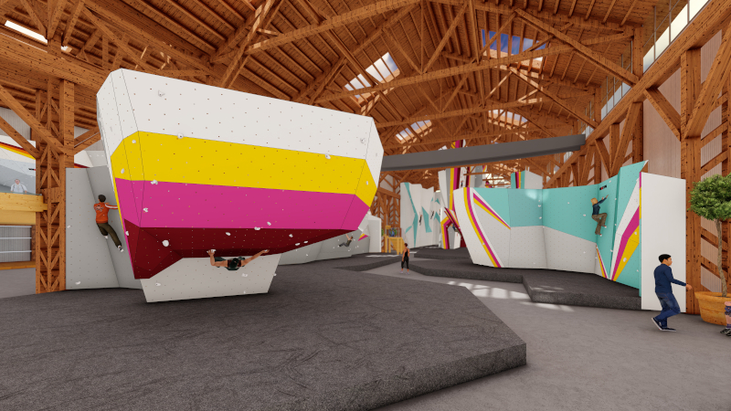
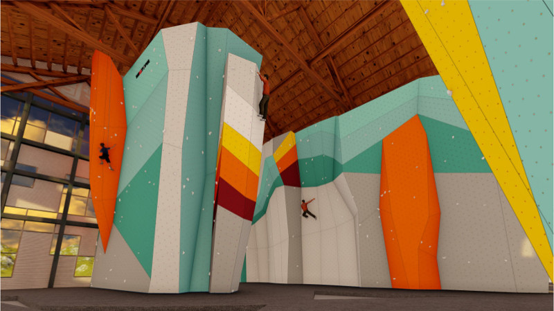
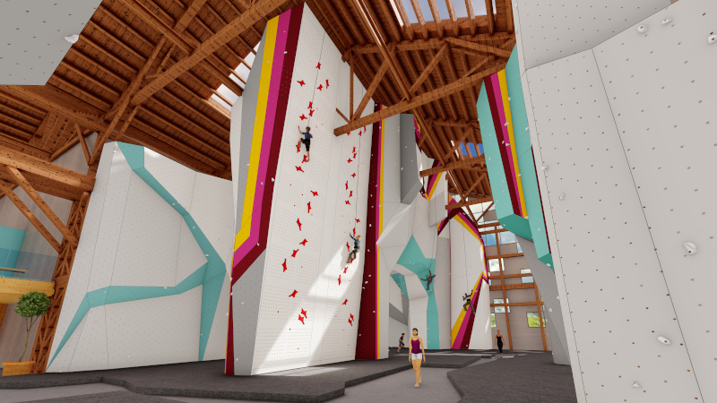
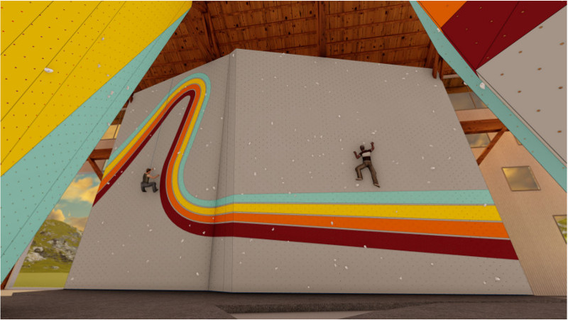
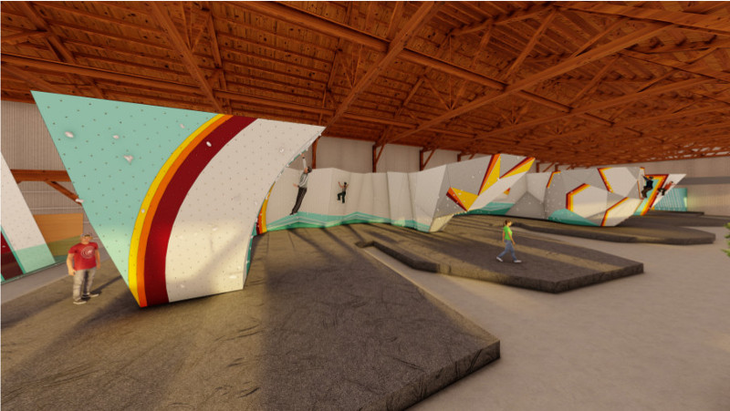
Gym layout and amenities are certainly important factors in developing incredible facilities, but what truly sets Touchstone Climbing gyms apart is our wall design. Designing climbing walls that are thoughtful, aesthetically pleasing, and serve a wide variety of needs is a group effort. We sat down with two powerhouses on our wall design team, Lyn Barraza (manager of Berkeley Ironworks) and Justin Alarcon (Touchstone’s routesetting director), to talk shop and learn about what goes into developing amazing terrain. Photos are Walltopia wall renderings from our forthcoming West Oakland gym, Pacific Pipe!
 So what goes into wall design as opposed to overall gym layout?
Lyn: In many ways we are dealing with similar concerns, such as foot traffic/flow and how to best utilize space. We are also looking to provide enough variety in climbing terrain to appeal to the different tastes of folks climbing at the gym.
Justin: The wall design is a crucial part of how the experiences of our members and guests are shaped. The climbing itself is a part of that—the sightlines, the experience of moving through the gym, socializing, and of course the safety of everyone inside are all heavily influenced by the wall design. I draw from my experience as a gym manager, climber, and routesetter throughout the process, and it isn’t uncommon for these perspectives to have opposing design wishes.
As mentioned in a previous post, we work to create gyms that feel unique but consistently Touchstone. A big part of that comes from the color schemes—you can tell immediately which gym you’re looking at from a photo alone. Can you talk about how you come up with the colors for each gym?
L: We are really fortunate to have Patti Phillips, our retail manager, on the wall color team. Her background working with world-renowned artist Sol LeWitt has been instrumental in creating a look that is distinctly ours. Each gym has come with its distinct challenges: With Dogpatch Boulders, it was learning how to use climbing walls as our canvas; with Verdigo Boulders, it was using Walltopia’s color printing method; and with Pacific Pipe, it was figuring out how to color such so much square footage so that the walls look cohesive but not boring.
J: I don’t have much involvement in the coloring of the walls other than to suggest red, blue, and yellow every time. For some reason we still haven’t gone with that combo…
A lot of modern setting uses huge volumes to change the terrain. Can you speak to how this method compares to building in special features in wall design? What are the advantages or limitations to both?
L: The creation of volumes for climbing walls was a game changer. When designing new walls, it’s a fine balance between creating visual interest and specific climbing styles we know people enjoy (arêtes, dihedrals, roofs, etc.) and allowing for setters to change the climbing terrain with their use of volumes. We do our best to balance this by having more featured areas of the gym and also offering plenty of continuous angles that can be dressed up with volumes.
J: There is a healthy tussle between the Touchstone wall designers around the question of built-in features and the use of volumes to create variety. Setters love using volumes as it gives them more room for creativity, but whether they’d admit it or not, sometimes it is helpful to have wall design that nudges them in a certain direction.
What considerations go into to wall design? Do you have to think about how the walls will set? Are there trade-offs to really unique features versus simple panels?
L: I think we’ve learned a lot over the years since we first designed Dogpatch. We use fiberglass more sparingly in our designs, if at all, due to its limitations and the difficulty that setters have on that material. Because volumes and larger holds need to attach to a continuously flat surface, the curves that are so appealing in fiberglass end up being impractical for everyday use. We also try to avoid angle changes that create sharp edges and take fall zones and safety into consideration.
J: We make a deliberate effort to create terrain that borrows from proven designs we’ve done before while always looking add new elements that will be fresh. Some of the creativity comes from working with and around wall construction and building limitations. Sometimes these limitations can be really frustrating, but the problem-solving they demand has often led to most satisfying designs. Further, we build these gyms with the idea that they are going to be around for a really long time, so we spend a fair amount of time philosophizing about what trends in climbing will last more than just a few years.
Are there any features that you’re particularly proud of designing? Any that didn’t work out the way you thought they might?
L: I love the design of the Cliffs of Id barrel wall, often referred to as The Squid. It’s a massively steep feature that rears up to 16+ feet. It’s a monster and my response to route climbers who asked for a way to increase their power endurance on the boulders. An unintended consequence is that it is often really hard to set any moderate boulder problems on it due to 30 feet or so of continuously steep climbing. I hate to say that there are a few features at Dogpatch that were super cool during the design phase, but didn’t quite turn out as as expected. For example, while an impressive feature, we rarely set anything to the top of the center arch due to its height.
J: I’m particularly excited and proud of a few features that are still being built, so I’ll keep those to myself for now. Most of the fiberglass features we’ve designed have left me wanting. Part of this is due to the frustrations involved in setting them and part of this is due to the difficulty of predicting how these more complex design elements will be to climb on.
What makes our approach to gym cracks so unique? What are your thoughts on gym cracks in general?
L: Oh man…indoor cracks are controversial. Most climbers will never touch an indoor crack. Other people complain that we don’t have enough indoor cracks to practice or train on. We will typically design the entire gym and then take a look to see where cracks make sense. We tried to add more cracks than usual in our Pacific Pipe design given requests I get from Berkeley Ironworks members. We’re always trying to figure out new ways to make great cracks, but we haven’t yet hit on a way to replicate anything like you’d find outdoors.
J: As Lyn mentioned, cracks are a real challenge. Unlike climbs set on “normal” sections of the wall, cracks are fixed sizes and thus more of a commitment—and adjustable cracks don’t work very well. Even deciding between how to texture the inside of a crack is a challenge because not everyone is going to agree.
How would you like to push wall design at Touchstone? Are there things you’d like to see adopted industry-wide?
L: I think our team does a great job of tackling each new challenge with fresh ideas while making sure that the tried and true climbing that everyone wants and loves is included. I look at a lot of new wall designs from different gym companies and am constantly impressed by how, as an industry, we are coming up with sometimes radically different climbing terrain than has been seen in the last 20+ years. As the technology changes, I expect to see even more of this.
J: I’d like the design aesthetic to continue to evolve so that no gym ever looks totally alike, but remain identifiable as Touchstone gyms.
What’s the most gratifying thing about wall design? The most frustrating?
L: It’s pretty amazing to climb on the finished product. It’s also wonderful to hear from people who don’t know you had anything to do with the design talk about how much they enjoy a certain feature or like the look of the walls.
J: The most frustrating thing is having a vision stifled by building limitations…The most gratifying thing is walking into a gym to see every feature getting some love (even if some get more love than others).
